Abri de la
Rive-Sud
Supporting unhoused women and men


The challenge
Why couldn’t a non-profit organization have a professional image like any other company? It is following this reflection that the team of Abri de la Rive-Sud called upon us to strengthen their position as a reference for emergency accommodation on the South Shore of Montreal.
The solution
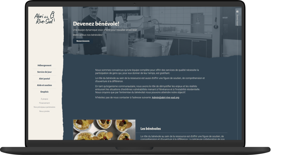
A modern visual identity, easy to use and easily recognizable, with a touch of color to add light to the sometimes dark issues that affect the people for whom Abri de la Rive-Sud is an invaluable resource.
A simple, clear, and human identity
Logotype
The emphasis on the words Abri (shelter) and Rive-Sud (South-Shore) presents at a glance the organization’s vocation and location, in a handwritten font that evokes the human side of the services offered. The silhouette, which appears to be in reflection, recalls the precariousness of women and men in homelessness situations.

Fonts
A range of varied and versatile fonts allows for both pleasant reading of simple blocks of text and drawing attention to particular elements.
Colors
A simple color palette, mostly sober and cool, but with a touch of color and warmth, in line with the organization and the services offered.
A rewarding involvement
When we decided to collaborate with Abri de la Rive-Sud, we knew it wouldn’t be our most profitable project. But in the end, we were more than winners in recognition, visibility, and pride in contributing to such an essential service in our community.
Online Accessibility
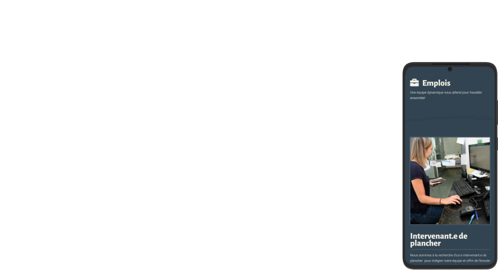
Thanks to its new website, Abri now offers an open access application at all times for people in need who would like to use its services. In addition, featuring the role of volunteers and the accessible online form has increased the number of applications received by 37%.


