Amélie
Coderre
Breaking into a growing market
Branding,
Strategy,
2022


The challenge
The real estate brokerage market is saturated and competitive. For a broker at the beginning of their career, how can they build a credible image and stand out in such a context?


The solution
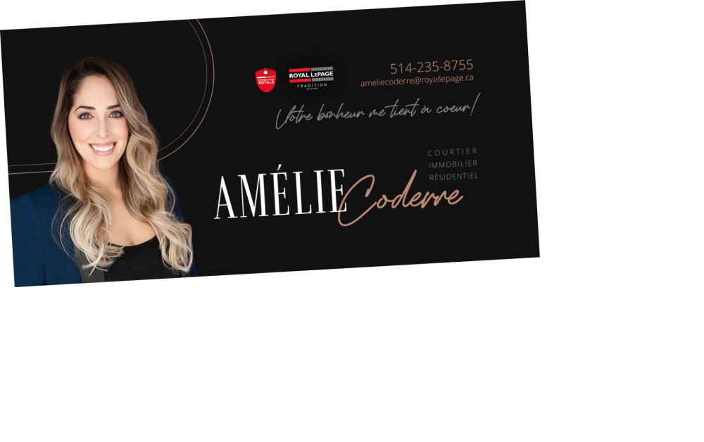
In order to make an impression, a new visual identity has been uniformly applied to all promotional materials. An image that is both strong, versatile, and feminine, where everything has been thought out to reflect Amélie’s humanity and professionalism.
An identity that’s chic, professional
and just feminine enough
Logotype
With the first and last name at the heart of the logo, we ensure a quick and easy reading, and the full official title is integrated in a friendly manner.

Fonts
The selection of fonts reflects both the chic of Amelie’s high-end service and her human and personalized approach.
Colors
A color palette that perfectly reflects Amelie: elegant and subtle, but also feminine with a personal touch of rose gold.
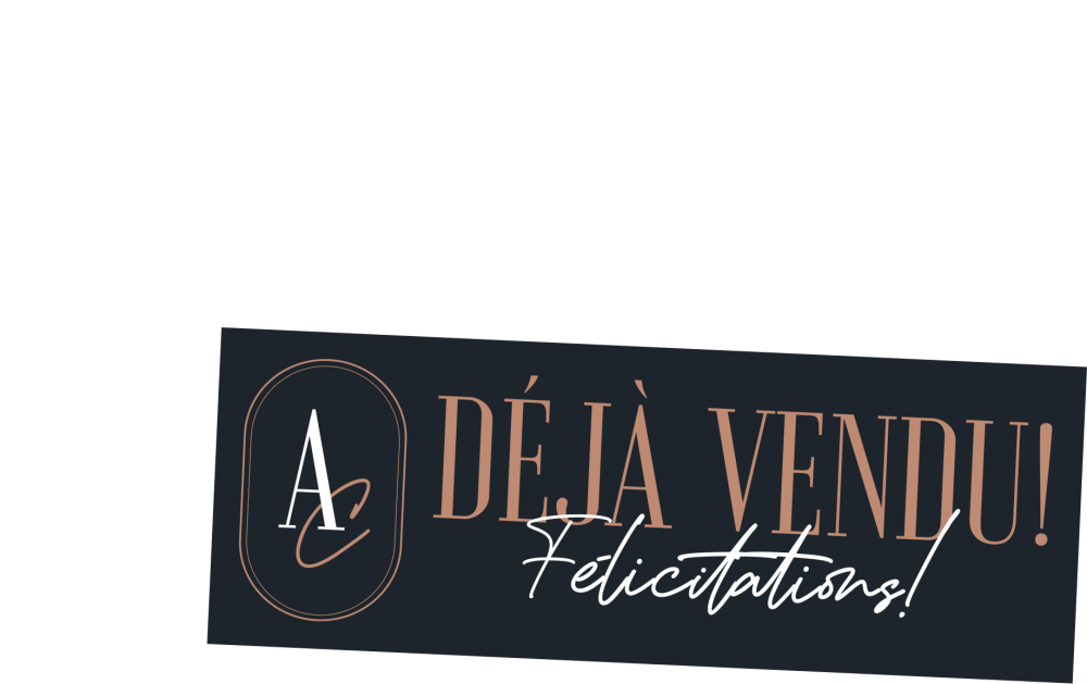
A striking image
To present a well-established image, the visual identity was applied to all digital and physical materials to make them easily recognizable.


The chic of chic
With their striking visuals, promotional materials and printed products grab attention with hand-lettered typography and a super sleek look.