Lignes
Plus
Trace the way to the top

The challenge
Lignes Plus is a marking company established for 15 years in Montérégie and Montreal. How can you position yourself as the reference in the region?


The solution
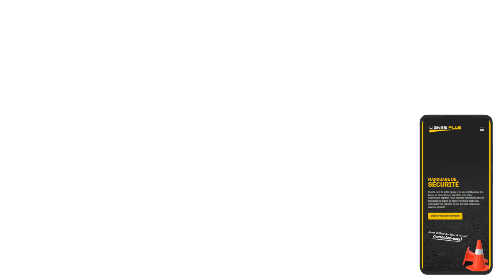
With a simple and effective website, designed for natural SEO, the company was able to climb to the top of search engine results.
A brand that speaks for itself
Easily recognizable, the modern and colorful visual identity illustrates the company’s domain with ease and adapts to all digital and physical media
Logotype
A simple logo with clean lines and right angles evokes the precision of the results delivered by the company.

Polices
The main font is reminiscent of the stencils used, and a selection of versatile complementary fonts adapts effectively to any context.
Couleurs
An almost too obvious color palette includes the two most used colors for marking as well as that of the asphalt.
A revised website
Attract traffic
Optimized for organic SEO, the architecture of the site makes it possible to position the company advantageously on search engines in order to generate constant traffic.