Festival des
Bières de
Varennes
Branding,
2025

The challenge
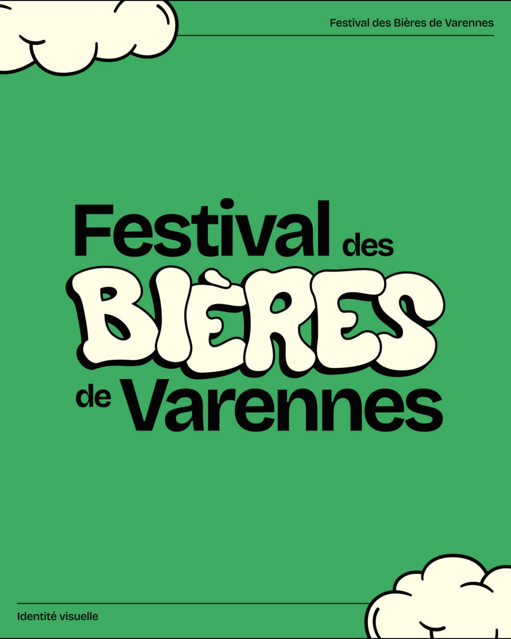
The Festival des Bières de Varennes is a summer event aimed at showcasing the products of local microbreweries, wineries, and cideries from the Varennes region. For its first edition, the FBV needed a visual identity that reflected its personality and helped position it as an appealing festival for the community.
The solution
A unique and vibrant visual identity designed to stand out and bring together craft beer enthusiasts, families, and the local Varennes community for a festive event.
A visual identity
with layers
It was essential to represent the festival as both an official and professional event, while maintaining a warm and festive atmosphere. This balance guided every design choice, from the logo to the color palette, to create a strong, lively, and inclusive visual image.
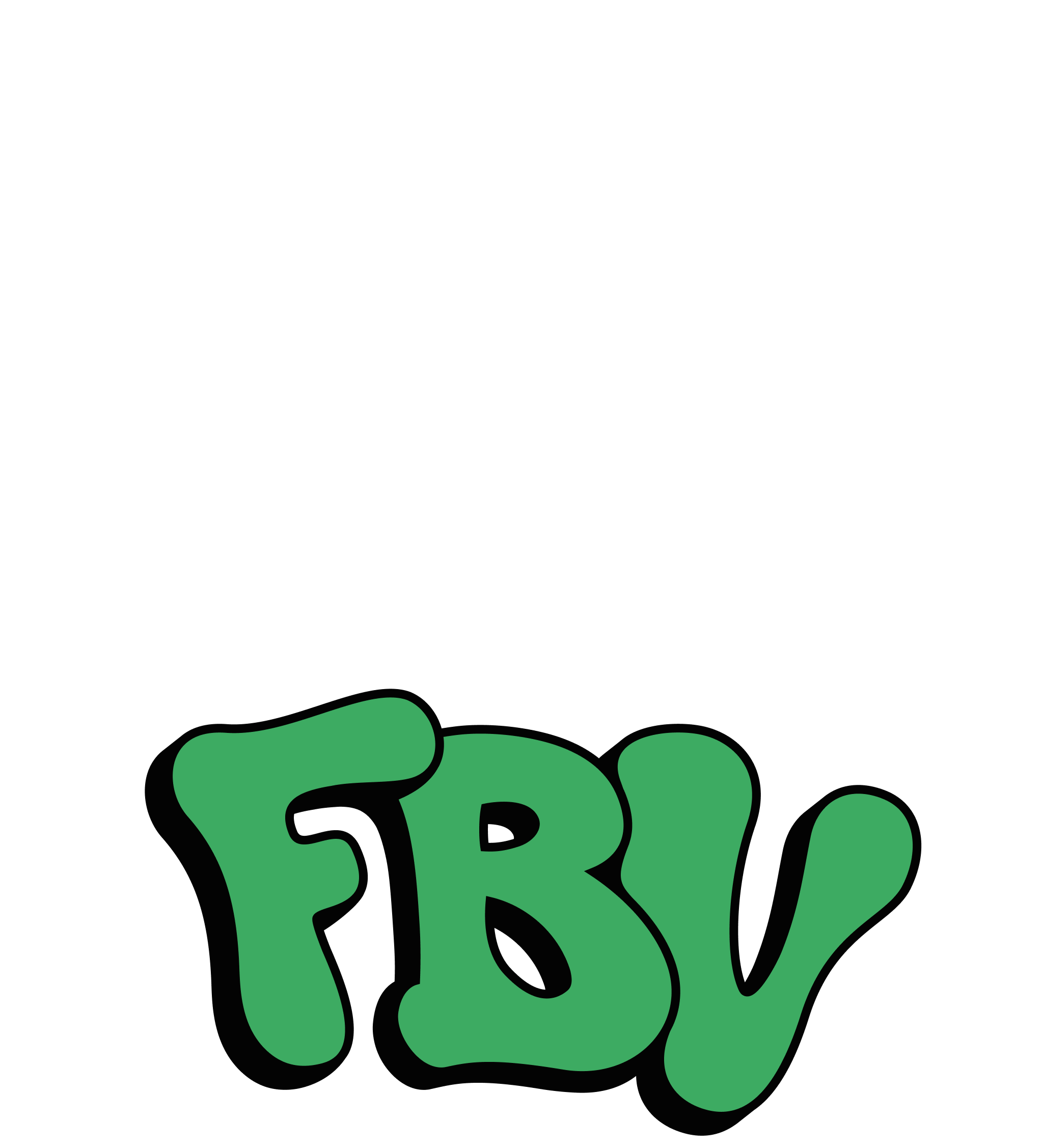
The primary logo
This logo is a textual representation of the festival’s identity. The main typeface conveys the modern and official side of the event, while the custom lettering of the word “bières” adds a more relaxed and festive touch.
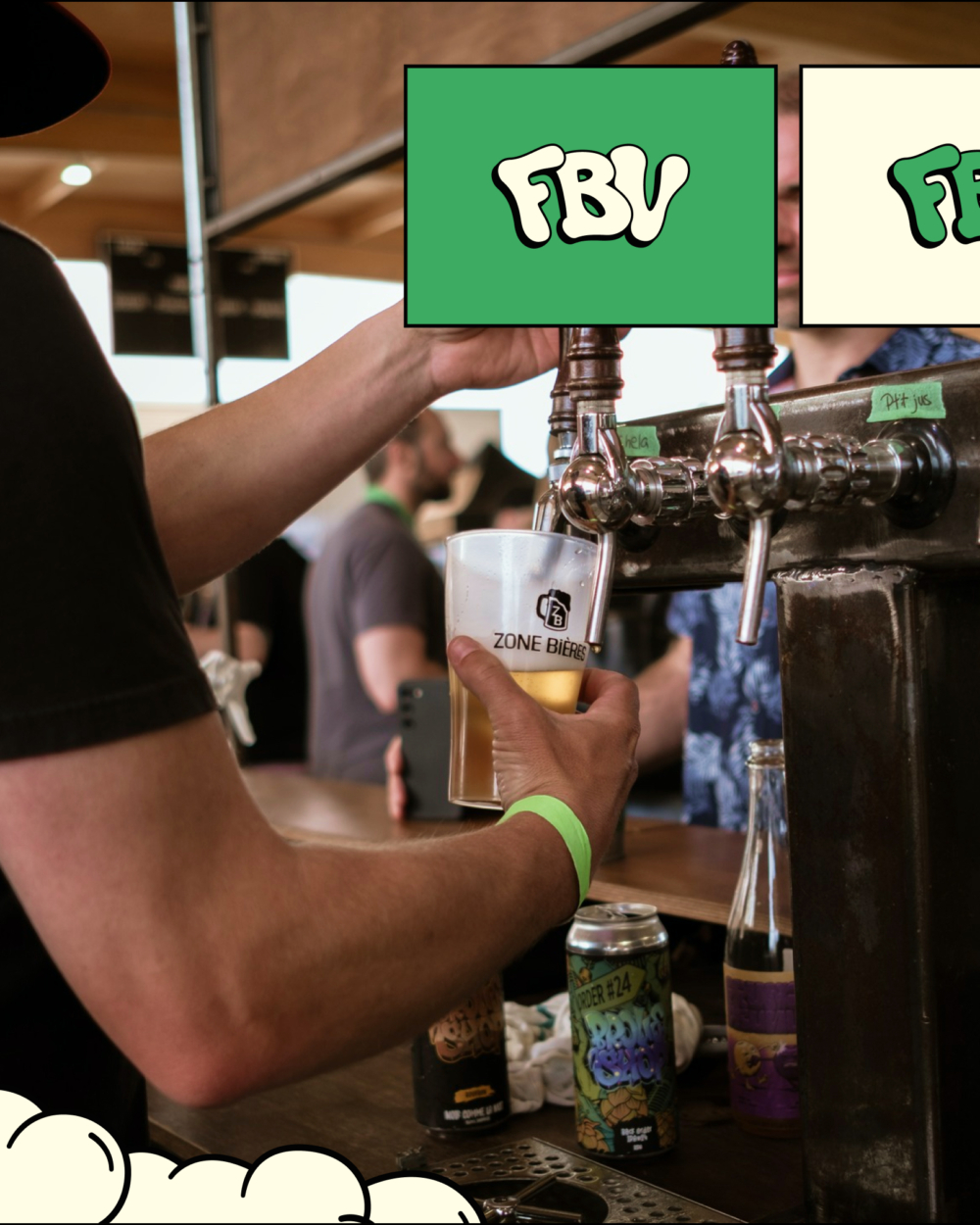
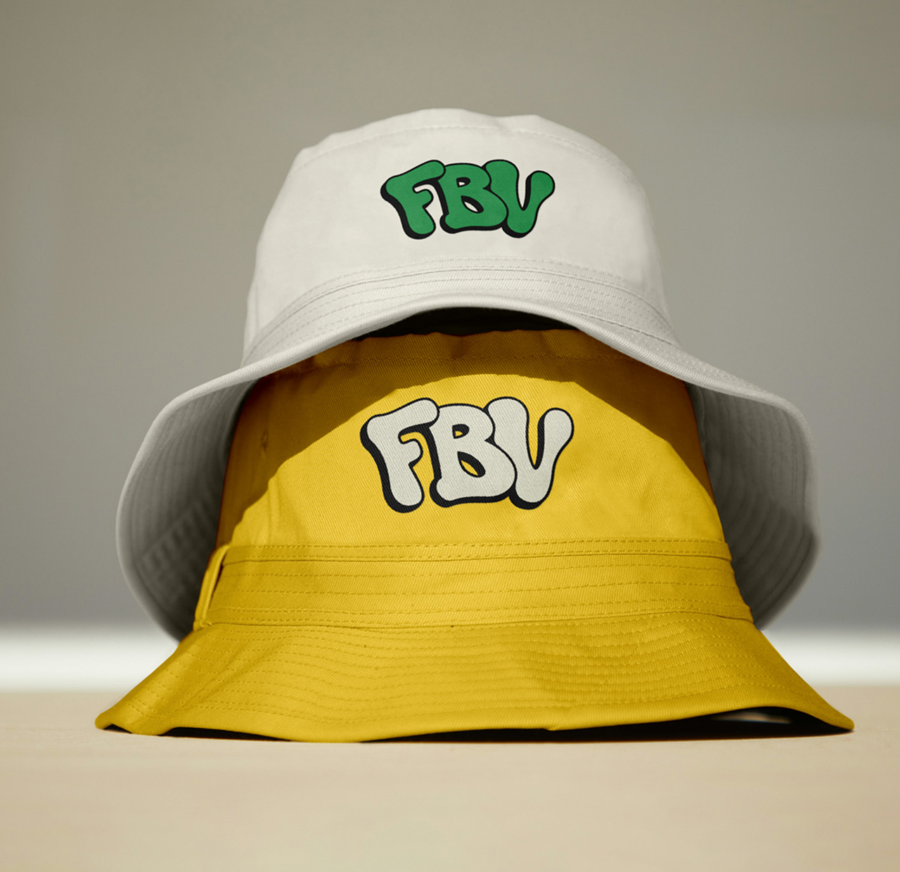
The secondary logo
This shortened version of the logo is ideal for smaller formats or when the minimum size requirements of the primary logo cannot be met.

Typography
Bricolage Grotesque is a typeface that blends geometric and grotesque elements with subtle unique details, giving it a distinctive yet approachable character.
Its versatility makes it an ideal choice for a modern and casual brand identity.
Colors
A colorful, modern, and summery palette, evoking a sunny summer day with a beer in hand.
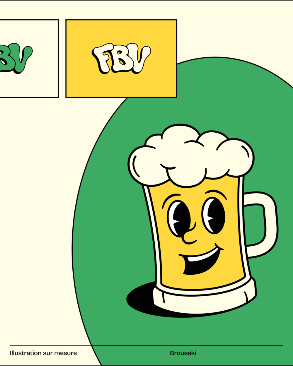
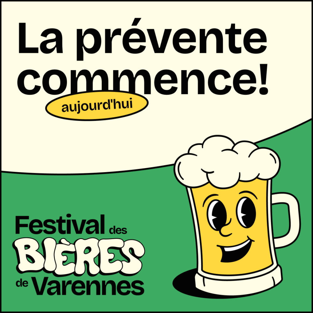
Meet Broueski
This retro-style illustration of the character Broueski serves as a perfect decorative element to reinforce the festival’s image. His beer-shaped form and cheerful demeanor strike the ideal balance to represent both the theme and the family-friendly spirit of the Festival des Bières de Varennes.

__
His name is inspired by the word “Brewski,” an informal term for beer. Let’s just say Broueski’s got plenty of foam in his hair!
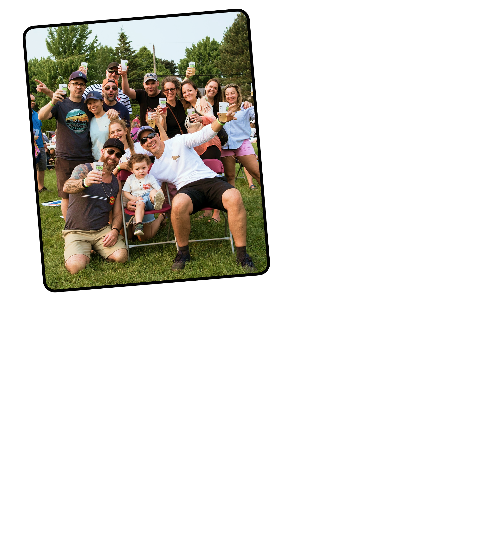
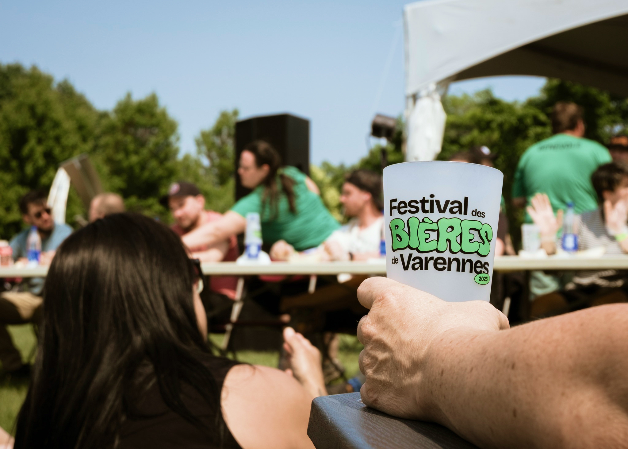
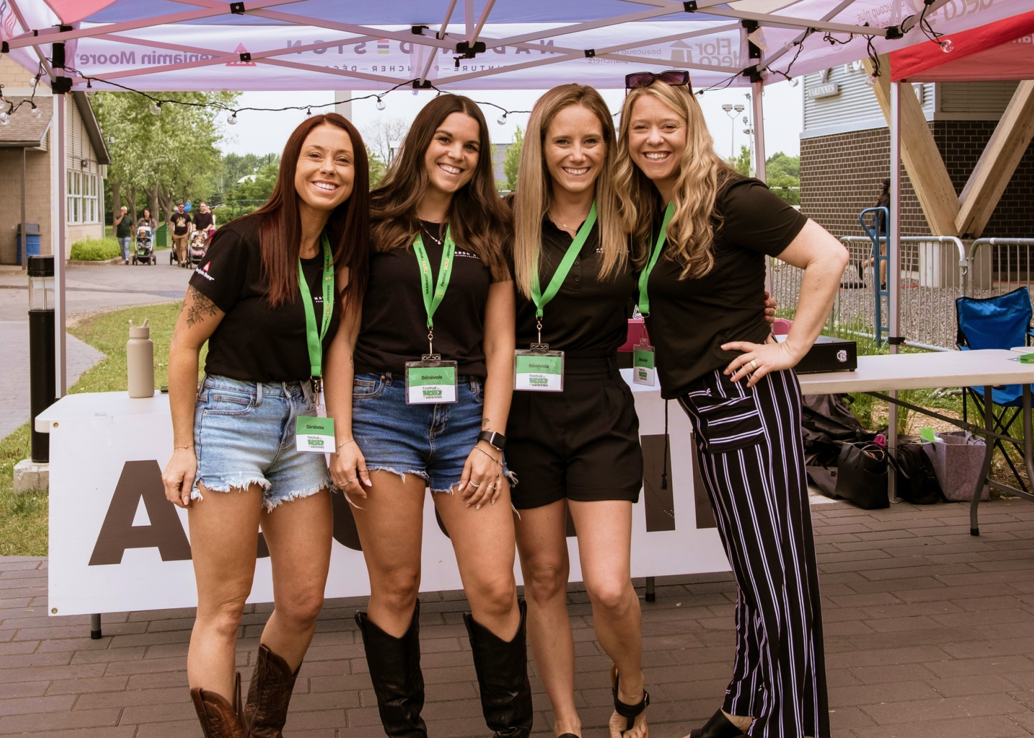
The brand in context
Testing a visual identity in real-world applications is essential to validate its coherence, impact, and adaptability. A successful identity is never static, it evolves as it comes to life and interacts with its environment.
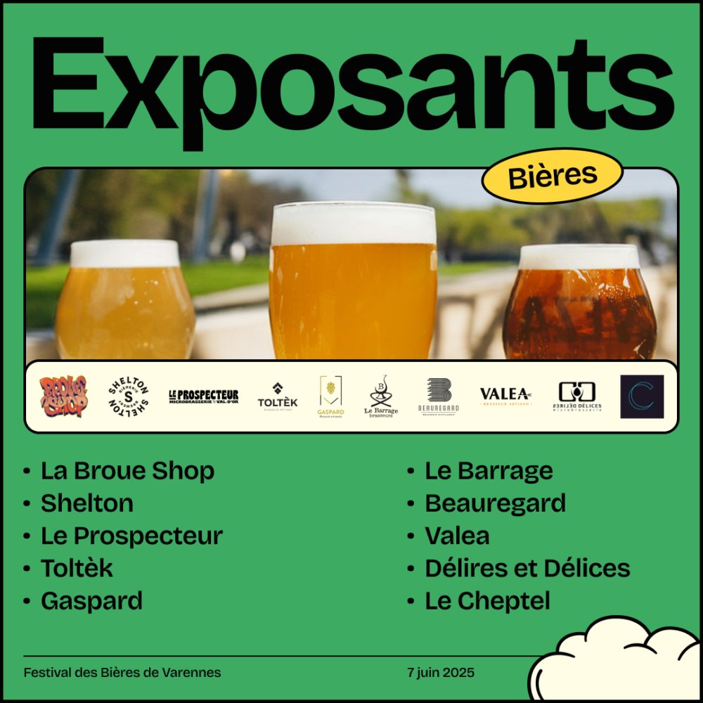
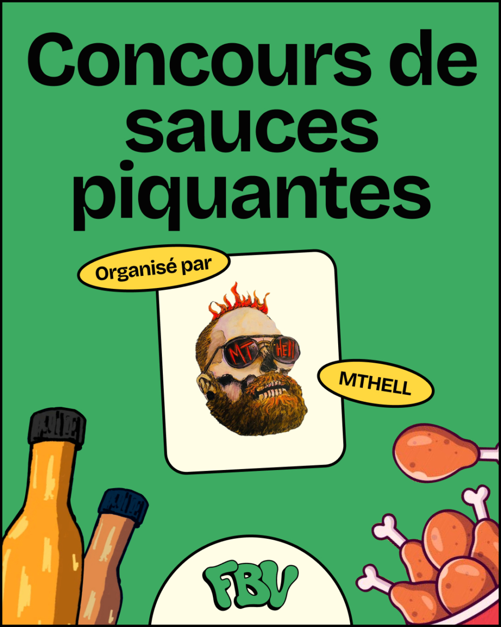
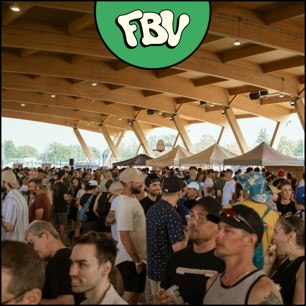
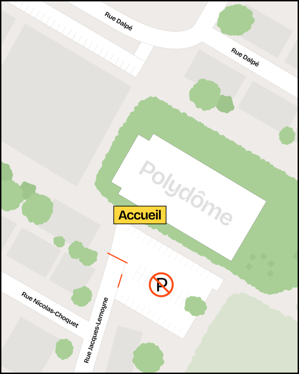
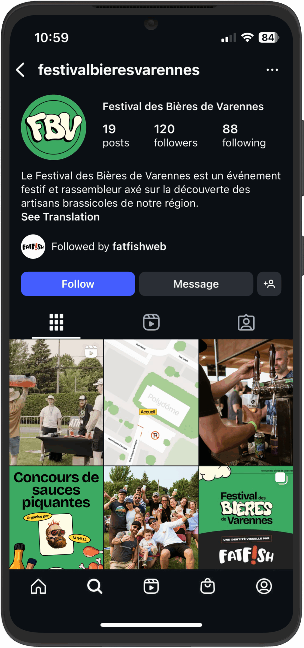
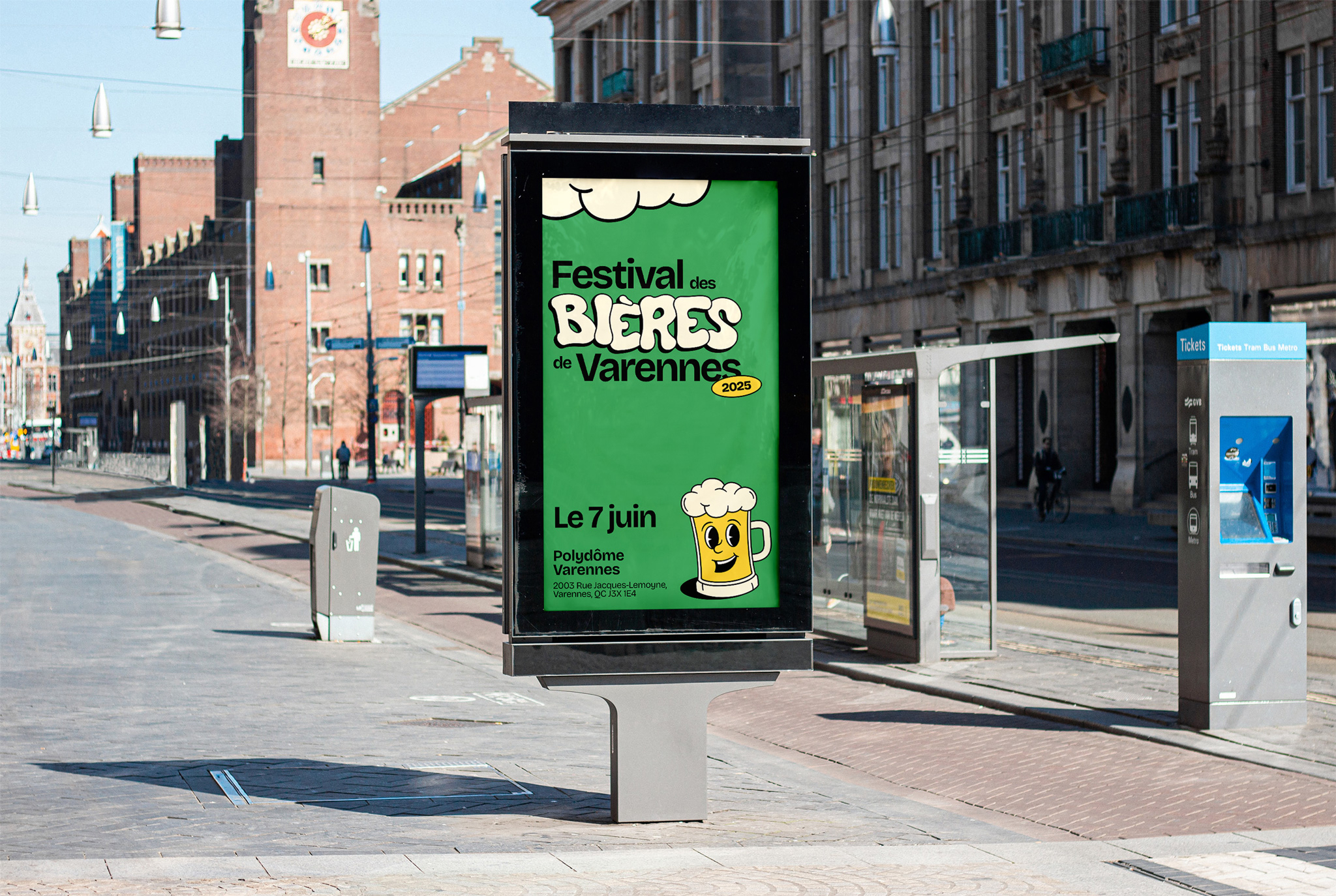
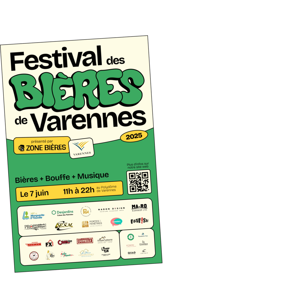
From digital to print
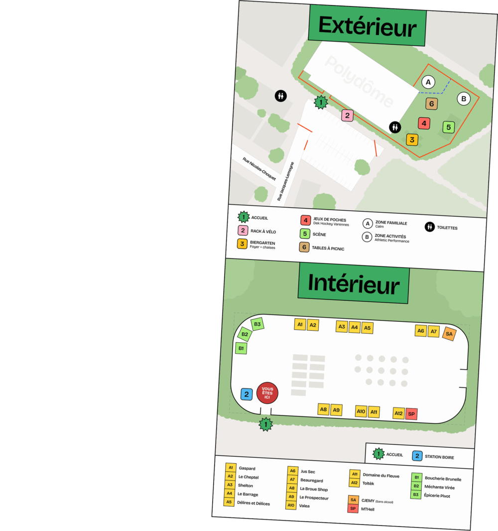
Our services go far beyond the digital realm. The festival required a wide range of applications: posters, banners, site maps, glasses, and more. Each piece was designed to extend the brand experience into the physical world, with careful attention to materials, finishes, and visual consistency.

NEED A VISUAL IDENTITY?
Because it is the foundation of each project, its soul, and personality, it’s essential in the first moments to seduce and hook your potential client in order to make them want to learn more, and we are here to help you do that.