montarville
A new player in construction management

The challenge
The montarville team offers services ranging from pre-project analysis to project management and traditional construction. As a new player in a saturated market of companies, how can they stand out?
The solution
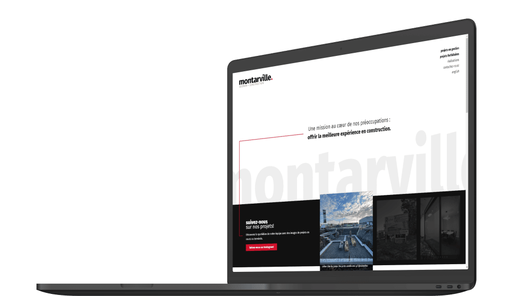
Simple and understated, the company’s website clearly presents the range of services while showcasing the spotlight on completed projects.
A identity that’s sleek
and outstanding
Logotype
Modern and sleek, the logo combines the company name and the two service offerings, with a characteristic red dot.

Fonts
The simple and modern fonts are subtle, allowing the images of the company’s projects to speak for themselves.
Colors
The ultra-simple color palette, enhanced with a distinctive and contrasting touch of color, attracts attention and makes the whole recognizable at a glance.
What else to say…?
Dynamic news
In order to bring some life to the homepage, the company’s Instagram feed has been prominently displayed. This allows the client to easily update the website with their latest news.

Printed products
To maintain a consistent visual identity and flawless professionalism across all their communication media, the montarville team commissioned us to apply the vision of the website to their various promotional materials (corporate folders, business cards, vehicle lettering, etc.).


